


Resolving Data Table Components Paradox
Supporting designers working in a constant-evolving condition with easy-to-scale table components in Figma encompassing flexiblity, scalablility, and consistency.

Primary role
Product Designer

Project duration
3 months

Company size
300+

Industry
Market research, B2B, SaaS

Tools
Figma, Google Doc, Jira, Confluence

Main collaborators
Design, PM, Engineering
Executive Summary
Prior to this project, it took 1hr+ for Suzy designers to design one data table using assets provided from the UI library. There was no consistency and scalability in the deliverables. I flipped the challenges by not only adding but advocating the scalable and flexible table components and its correct adoption in the design system library for all designers, significantly boosted design efficiency and product development speed.
Metrics of Impacts
Our focus was to improve designers experience by allowing them to design more efficiently for data heavy projects, we evaluated success through:
🚀 Pre- and post- design speed
⭕ Component adoption and error rates
🙆 Component consumers overall satisfaction
🔎 Design implementation accuracy
These are snippets of what we accomplished:
500%
Design speed
75%
Component adoption errors
80%
Usage satisfaction
200%
QA process
These impacts were achieved by table components that are…

Read the short version of the story below 👇
A Troublesome Fact
Imagine you are suppose to deliver 10 different table designs by end of the week but all existing design asset you got is a cell, you will need to manually stack hundreds of cells together and create the design with no table level guidance on how to display rows and columns, how desperate! This was the situation Suzy designers were struggling with.

Everyone Bared the Struggle for A Reason
After connecting with teams, I learned the current component setup did not come from nowhere, it could be dated to a well-considered solution to delivering something that maximize fleixbility. However, it seemed to be outdated and push too much of an extreme that did not provide any speed and quality.
"Prior to recent heavy demand on table, this used to be the best solution to keep cell content consistent and scalable."
M.B.
UX Designer
"Before table got complicated, I was fine without a table component because this set up was the best solution to give me flexibility exploring possible table designs."
S.H.
Product Designer
Snowball Effect on Business
Until today, the table component improvement turned to a long term tech debt been pushing back due the complex consideration. By connecting with product managers on prospect projects and customer success team on table user experience, I received solid and shocking evidence to push for the change.
30%
User not accessible to data tables
80%
Tickets involving tables always delayed
1/10
Consumer satisfaction designing tables
2
Upcoming projects heavily rely on tables
The metrics had leadership realized the urgency:
"We need to fix the table component before the high demand comes."
Specifically, What Were the Challenges?
You might ask what makes this project specifically challenging comparing to other design system components? Imagine your are in a startup environment for SaaS industry where things are still evolving for the best of users and project pivots fast, we still want space to experiment what's best for our users while maintain consistency for product quality as best as we can. Because data table is the most complicated UI element involving so many elements, this struggle to balance flexibility and consistency got extracted 10 times more.
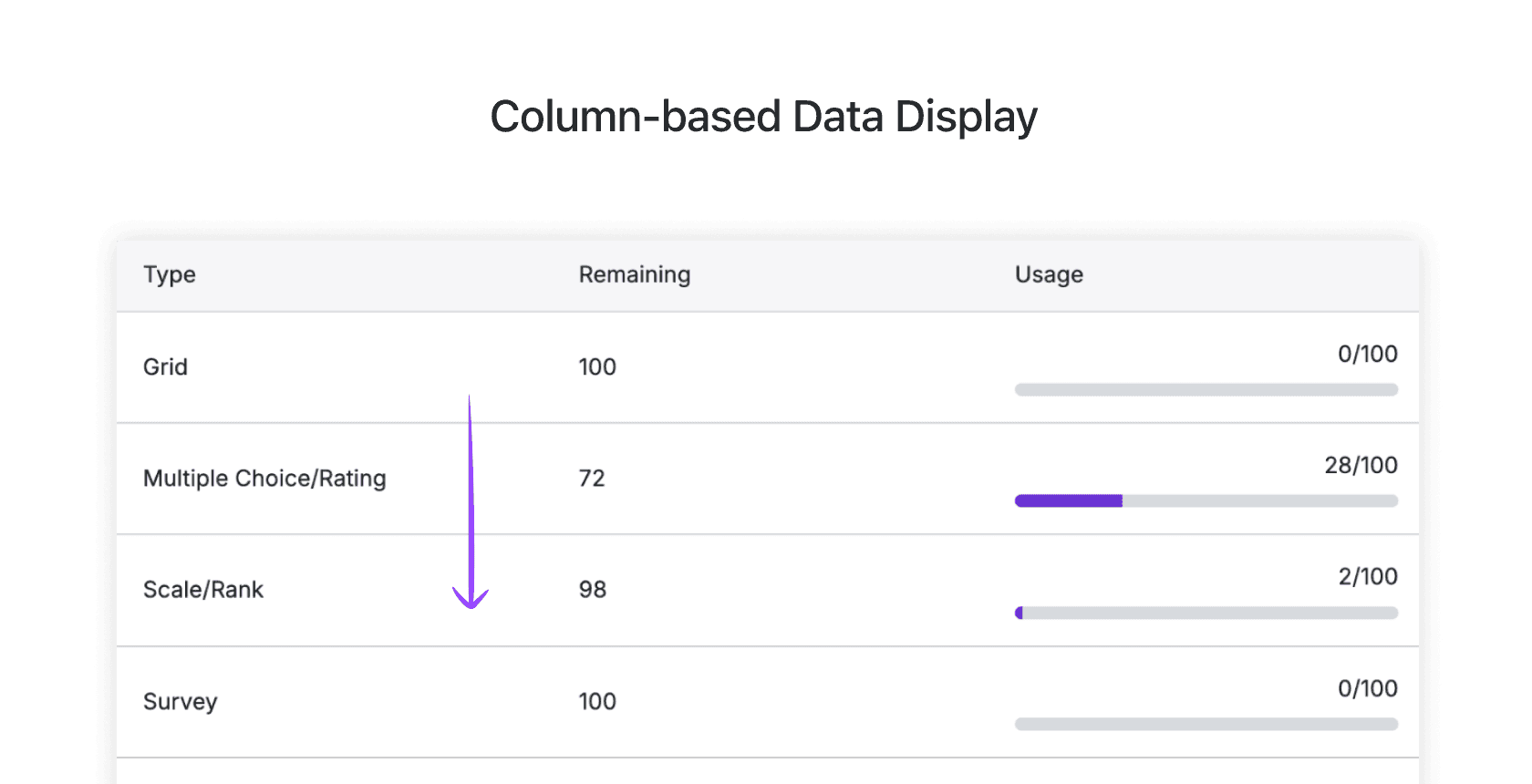
Example - Dynamic cell sizing
Unlike other design system components which designs typically follows one size fit all, on table, things are much dynamic. You might have typically shorter width content contained in the cell such as number or button, but also use cases involving longer content such as sentences, links or even more dynamic content like avatar group. There is no perfect cell sizing for all.

Examples from table design audit
Example - Dynamic layout and interactions
Cell only counts as a small portion of table component, on higher hierarchy, which was entirely missed from previous consideration, was different ways data were displayed on the table and how user interact with it.
2
Display direction

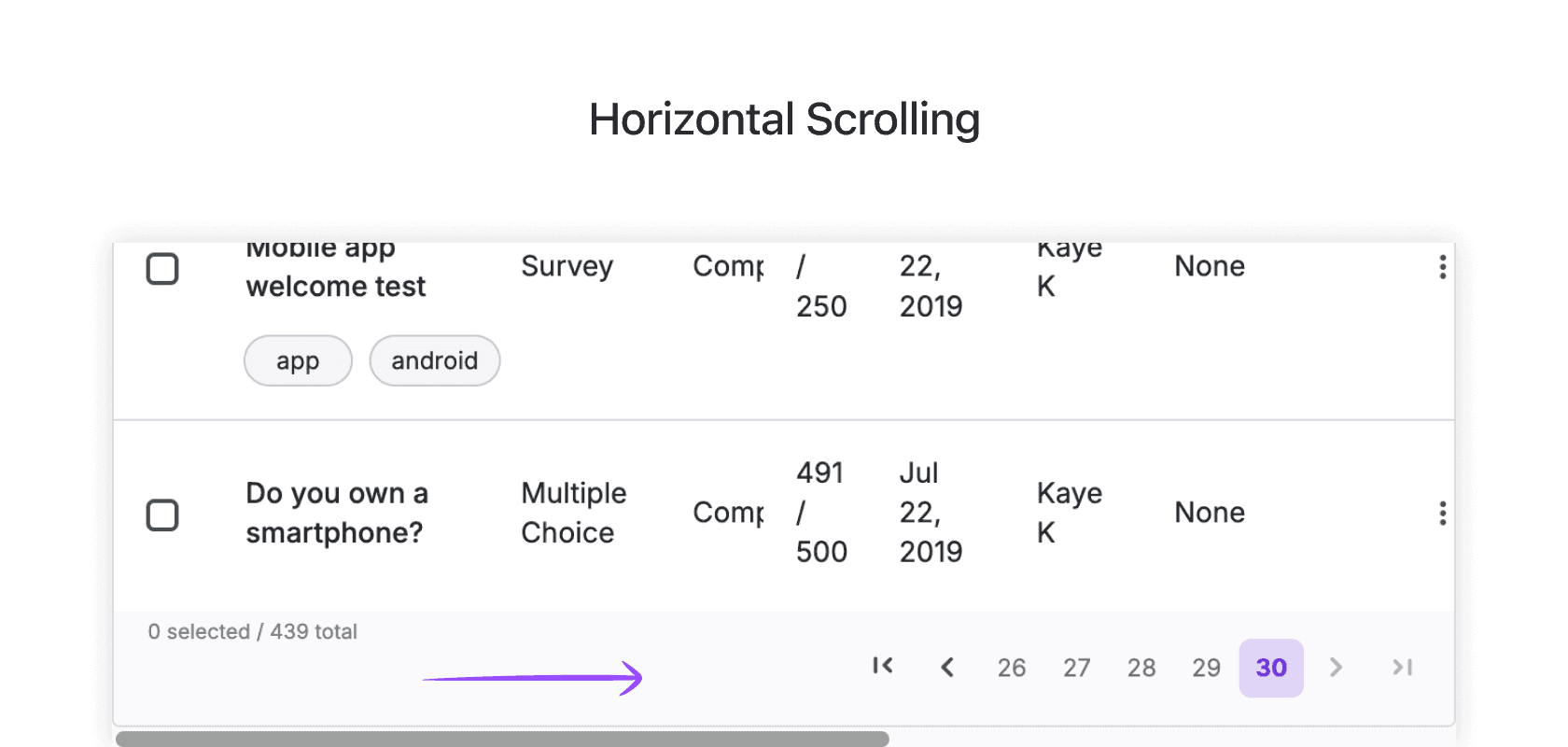
3
Interaction

Examples from table design audit
Once clarify existing instances among our platform, let's confirm from UX perspective of:
"What are the rationales behind these dynamic design decisions?"
Clarify the Design Patterns
First, I looked at table design considerations that remain consistent across designs, which can be narrated into two aspects: The universal table design consideration and our products inherit pattern. These areas should be designed be shared consistently and remain unchanged no matter how design scales.
To ensure I considered all aspects of table design, I rely on audit methods and analyzed each nested element through a top down approach.
The universal table pattern
I researched UX design rules for data tables and mapped out the fundamental principles that is common practices should be shared across all table designs, from aspects of Design Patterns(Visual and Structural), UX, Accessibility, and Interaction.

Our unique table patterns
To find out our product-specific patterns, I collaborated with the design team to analyze through audit the the same criteria.

If the design clarification appear complex to you, our designers had the exact same feeling! So what did I do to onboard all table component consumers?
Creating an Interactive Tree Map for Team Alignment
Table consist abundant nested variations that made the pattern hard to visualize with forms. So I established a treemap, consolidating from the pattern analyzation, separated by visual and structure breaking down the table design complexity into smaller, more understandable pieces.
Strategizing Thoughts Into Component Design
Upon agreement with designers, the best rule is when there is no rule at all. When exploring the component design, I prioritize baking the hard rules and flexibility of the component design into the property panel, setting the component usage guidance and documentation to be the last guardrail for correct component adoption.
Cell content option
Figma function allow me to prioritize content being swapped into specific cell, which natively baked consistency into designers workflow.
Custom tooling
I also developed custom Figma plugin to help designer check if they build the component properly.
Understanding Concern from Teams
I needed the solution to work for our team, from technical and UX perspective, I need to set up understanding of my collaborators' limit.
Designers have different technical understanding
Not component consumer had the same fluency in technical skills, which means
Use familiar technic and set up to build the component, Error prevention and education needed
I am not only design for designers
A design system component is not only for designers, but need to take consideration of end user, engineerings
Make it happen!
Component deliverable and highlights
Lore ipsum
Documentations and support
Lore ipsum
Evangelizing, Implementing and Refining the Vision
I believed in transparency and iteration over "big reveal" moments, especially for something as collaborative as a design system contribution model. Success depended on team alignment and shared ownership. To build trust and momentum, I shared progress and learnings daily in Slack, hosted weekly syncs, and actively participated in design sessions across teams. These efforts helped foster comfort with the new model and sparked enthusiasm not just among contributors, but across the company.
After we implemented the new contribution model:
Where Did the Solutions Take Us?
More Consistent Product Experiences
The systematic change to the contribution process created a ripple effect across teams. Streamlined component design made collaboration easier and engineering handoff clearer, leading to better-built components and, ultimately, a more consistent, user-friendly product experience.
90%
UI quality complains from clients
"Suzy’s user-friendly intuitive interface is significantly cleaner and more easy for us to navigate and extract valuable insights."

C.A.
Senior Marketing Manager from Sachi&Sachi
Reflecting on the Successful System Solution
Lore ipsum.
Thank you for reading!
I would love to know what you think! Feel free to hit contact below and I am excited to learn from your feedbacks.